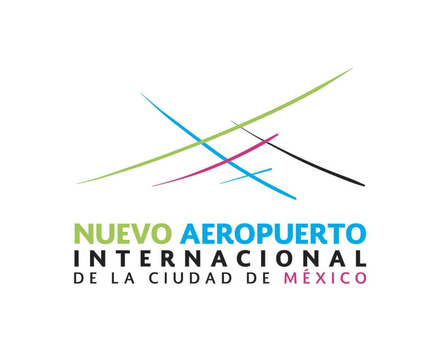
I would like to share the logo design proposal I submitted to the NAICM design contest for the New Mexico City International Airport, known primarily as Nuevo Aeropuerto Internacional De La Ciudad De México. A very hard design to make I must say, but I sure had a lot of fun with it.

The artwork represents:
1. The architectural aspects of the airport design forming various Xs and shapes.
2. The letter X that means more than just one letter in México. It is a symbol of Mexican identity that speaks of its past, present and without doubt of future generations. Many “X’s” that represent the many facets of México and the new ones to come.
3. The freedom and natural flow of planes in the air, as well as the Mexican spirit.
4. Flight and airplanes as well as arrivals and departures.
5. Condensation trails.
6. México and its new airport through the chosen colours; Green colour for hope, flora and fauna; Mexican pink showing México’s identity, vibrance and charisma; Black/white for sense of judgement, purity, and strength; Cyan/blue for trust and serenity. The cyan lines form an airplane pointing to the sky as well as to the word AEROPUERTO, symbolising the gateway to the sky and to the world.
7. Other things that are subjective to a person’s imagination and perception, e.g., all letters from M-E-X-I-C-O can be found inside the emblem or you may find pyramids being formed from the lines or mountains and valley which CDMX is placed in.
The logo like the airport architecture was inspired by the essence of México and its capital City while respecting the design of the airport and the nature of flying.[:]

